Rayban & Sunglasshut
More color, more life.
Luxxotica approached us to visualize the new RayBan campaign focussing on their new product line in a traditional classic Oostenbroek way.
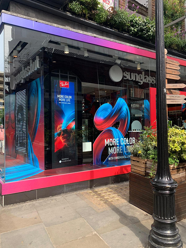
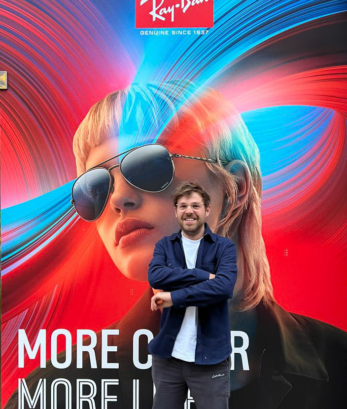
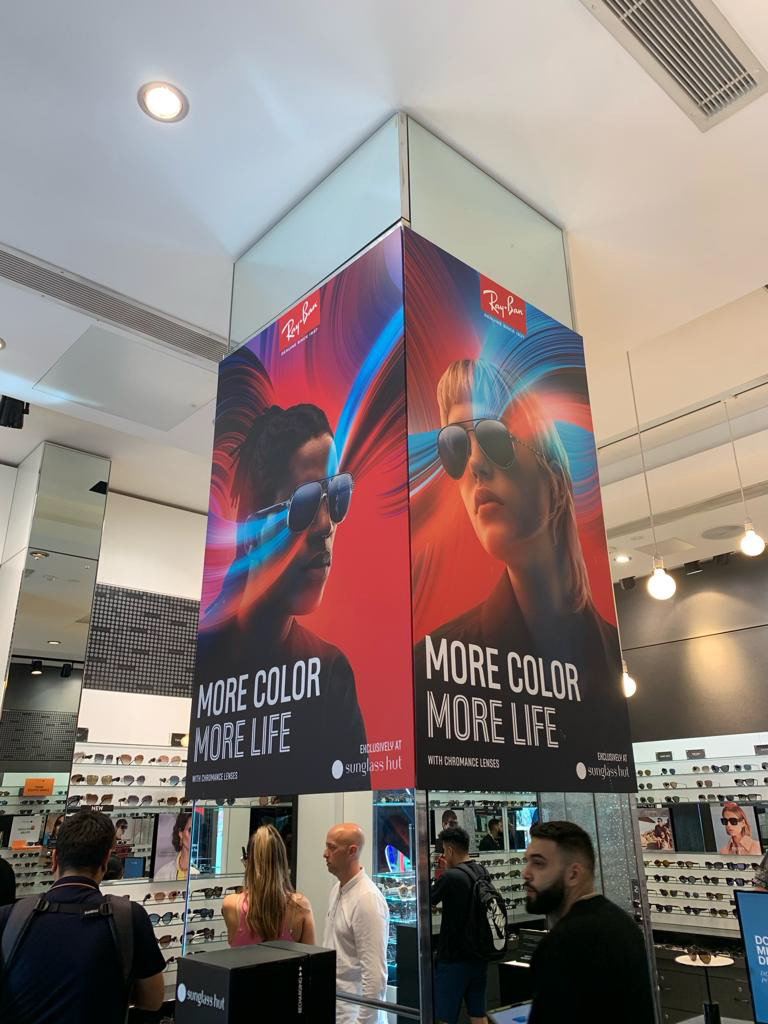
The goal was to create a package of assets that could turn any Sunglasshut globally into a colorful feast to celebrate the 2 new flagship products.
This includes stills, but also in-store animations and even an animation that played on Timessquare for over a year, right above the sunglasseshut there.
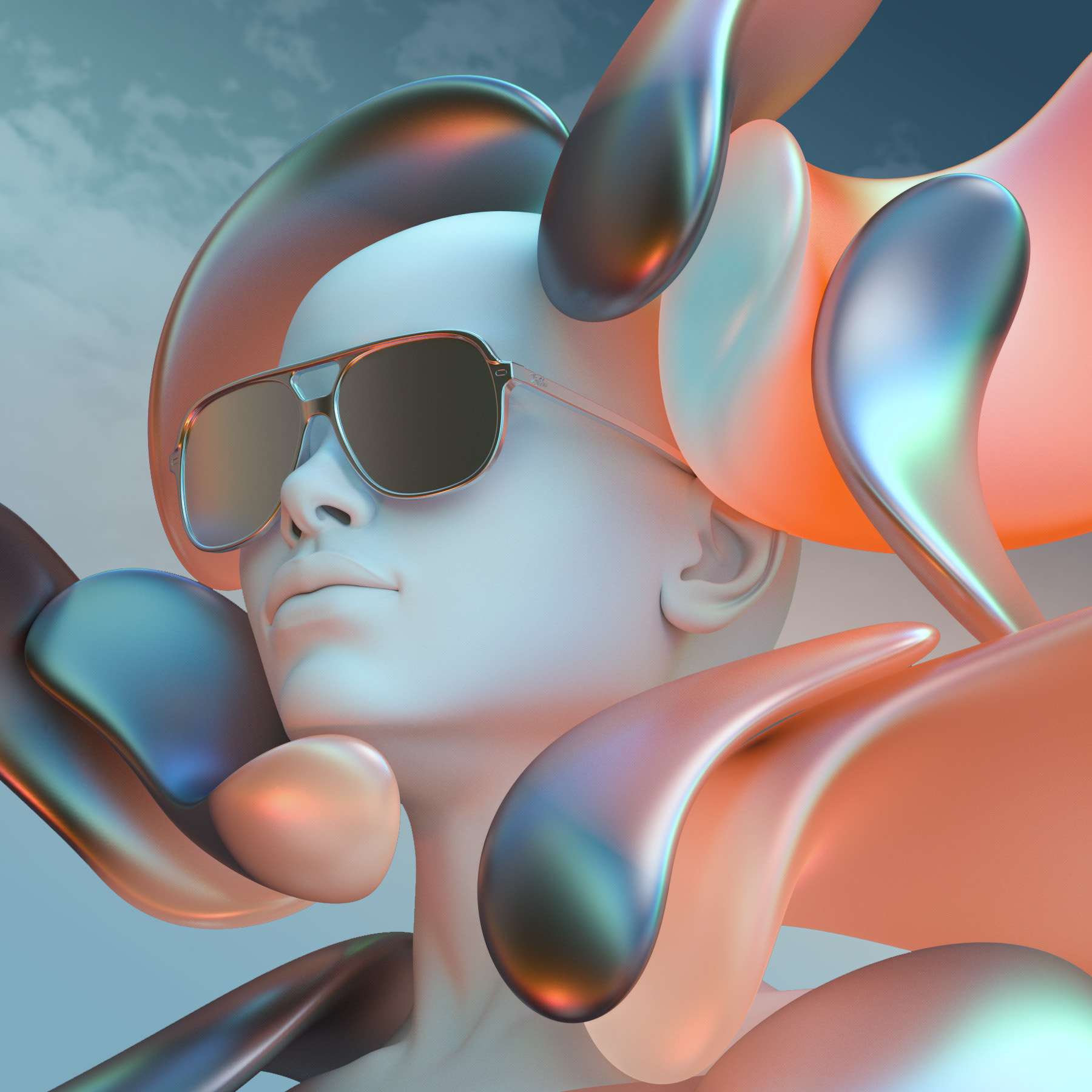
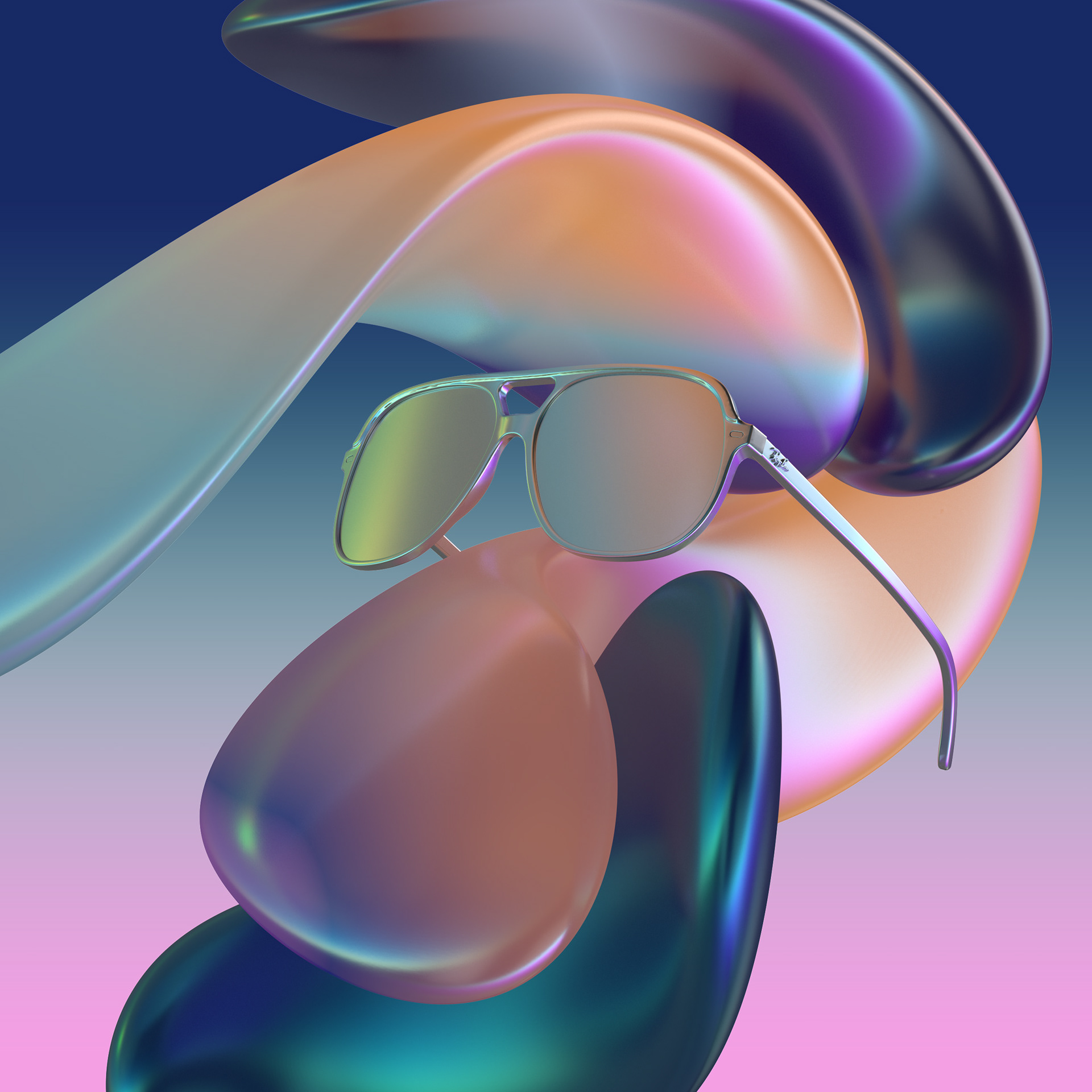
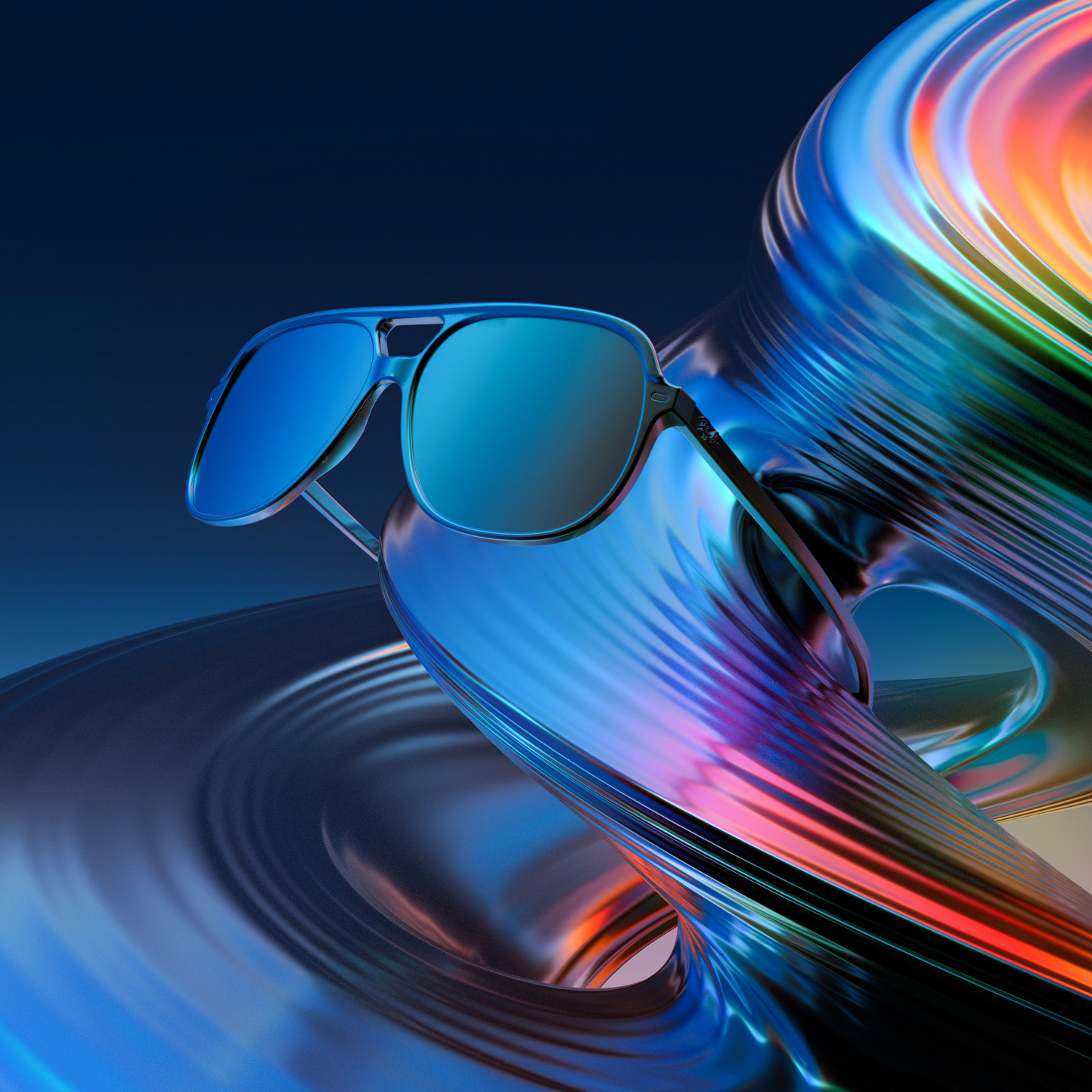
R&D Phase.
Concept explorations regarding visual components to create the colorful world the lens filters apply to the surroundings.
More color, more life was the payoff of the campaign and that should be visualized in an elegant way that references to the lenses without disrupting or overlapping the product too much. There was no way parts of the product should have been hid.
*This was before they decided everything had to be red/blue.
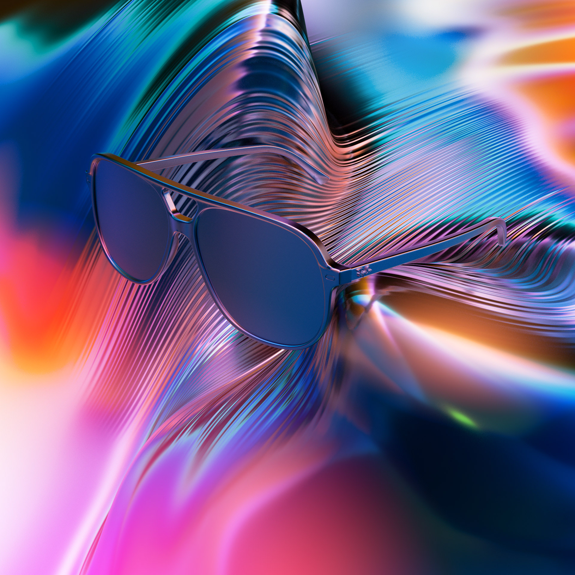
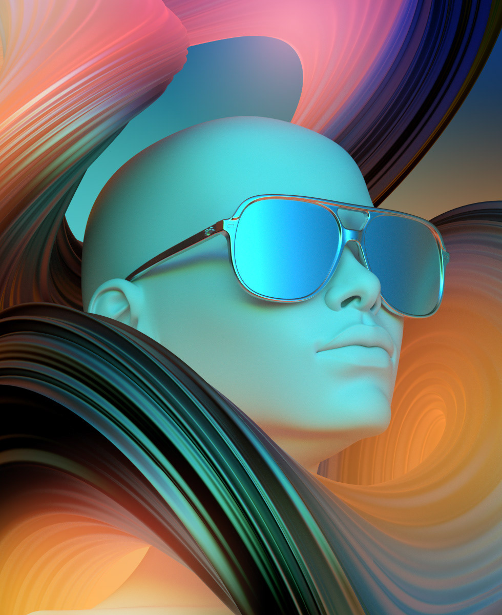
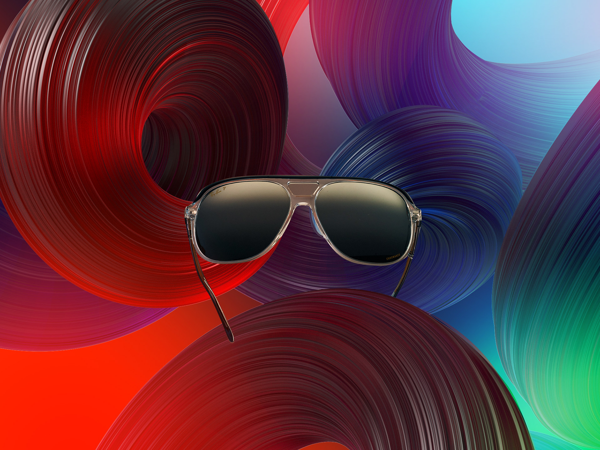
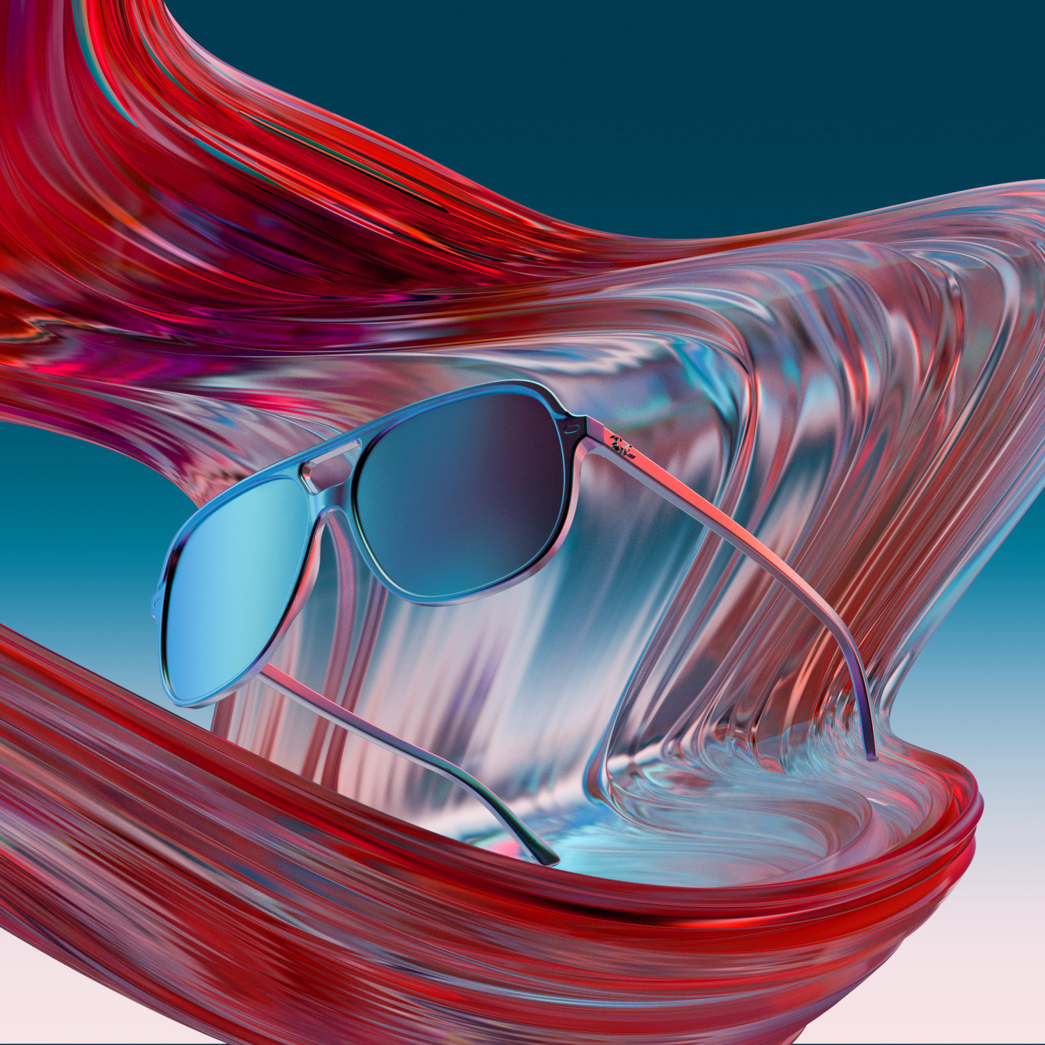
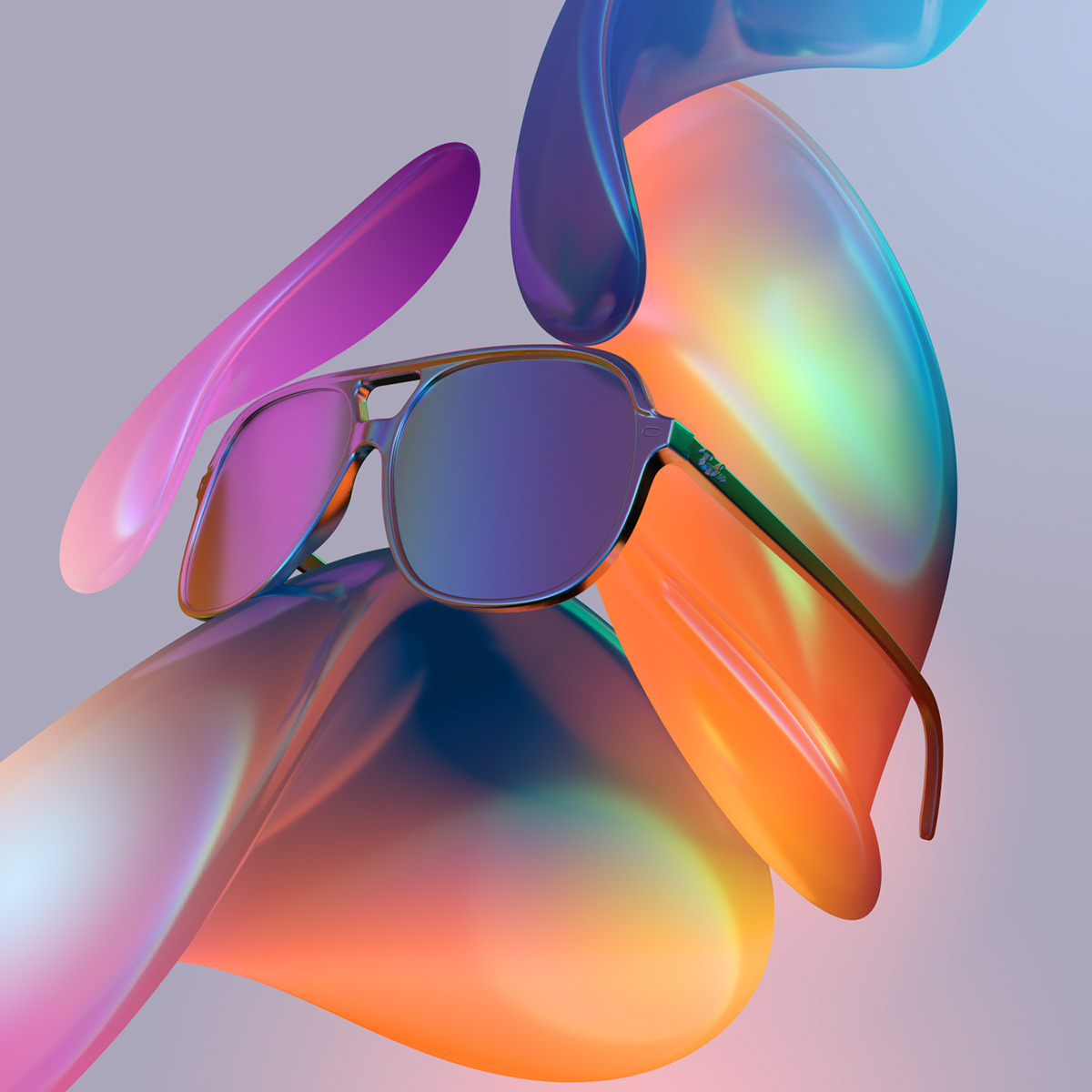
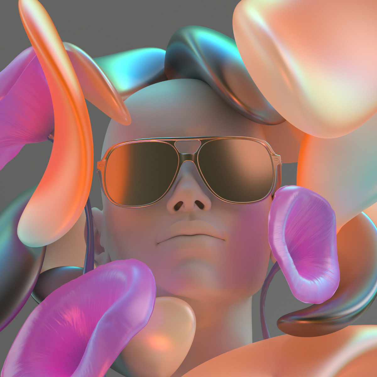
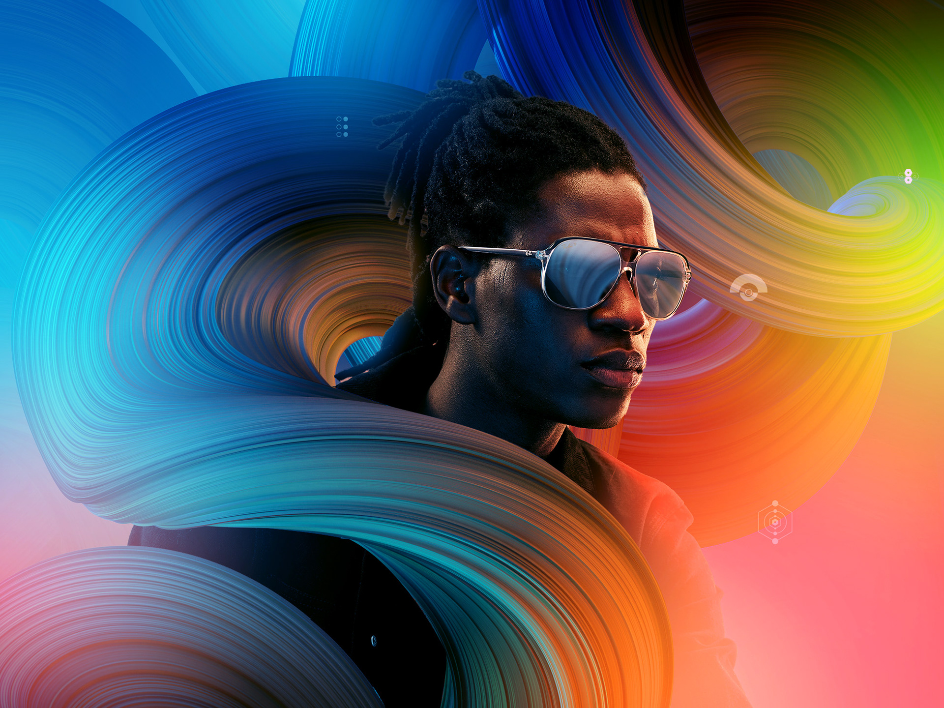
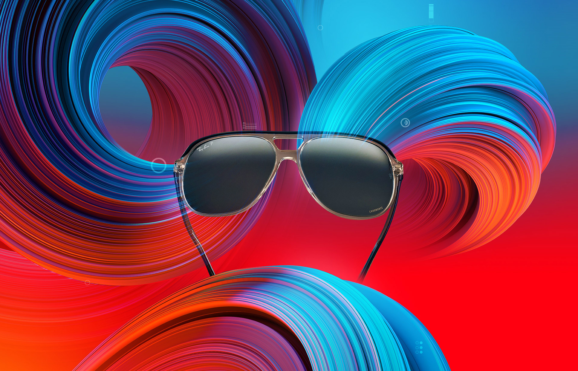
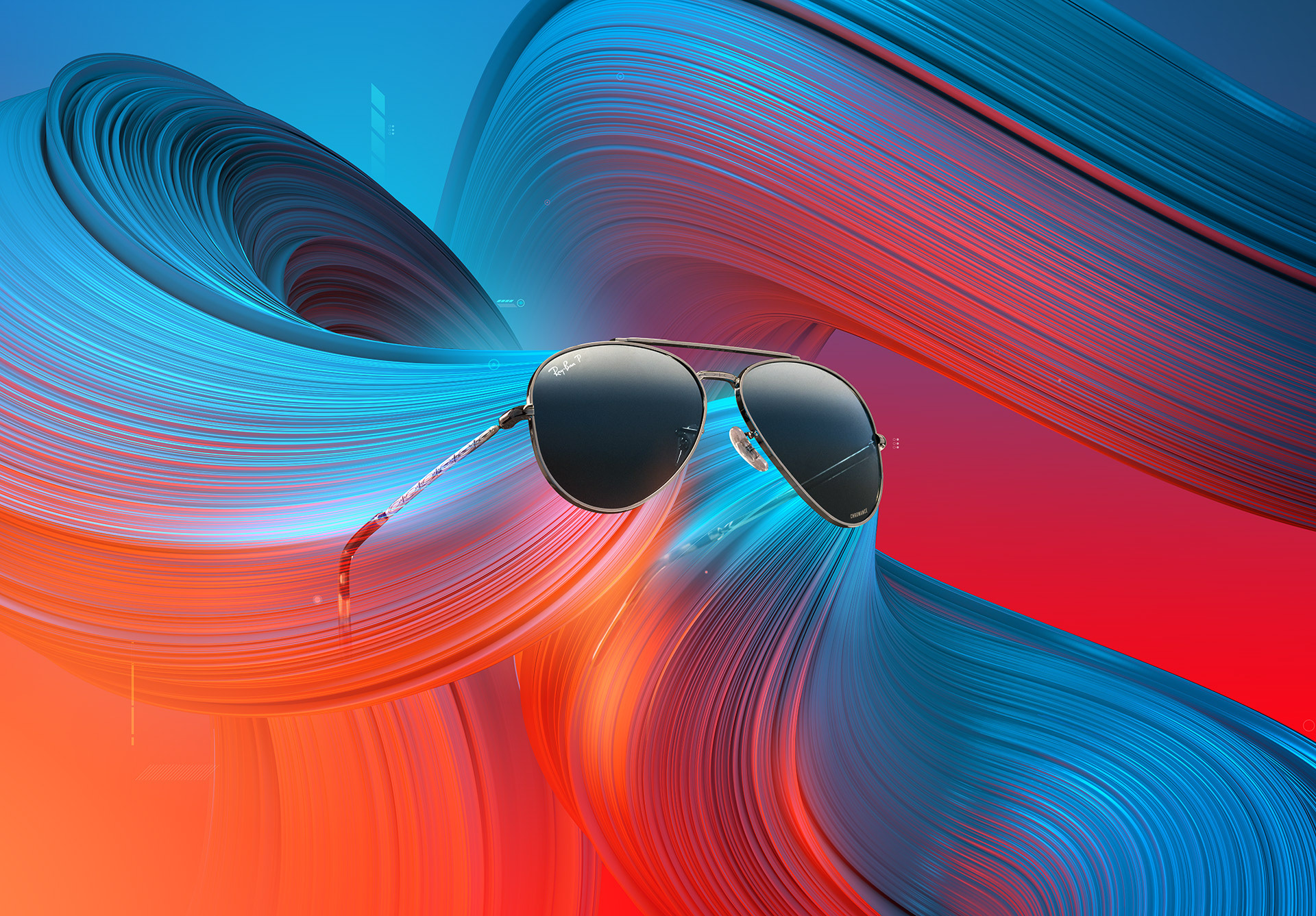
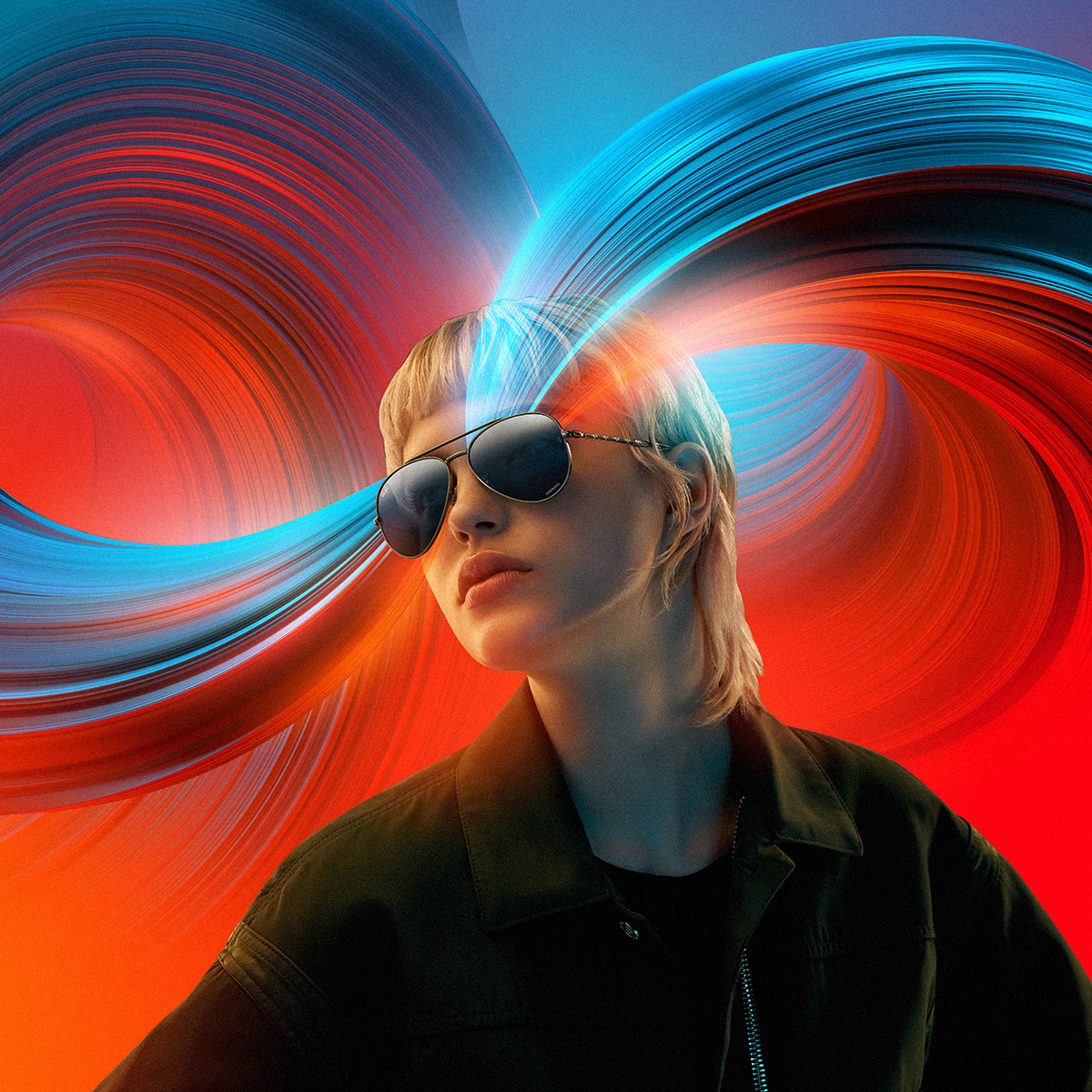
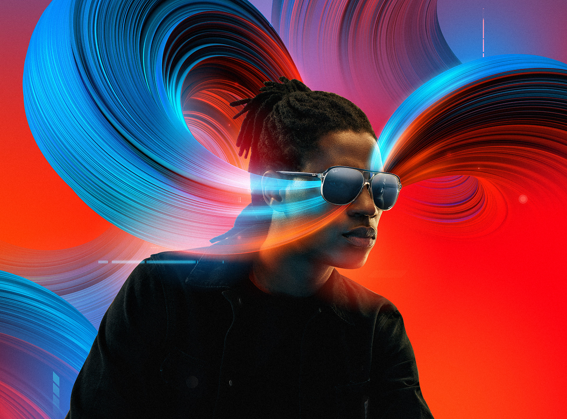
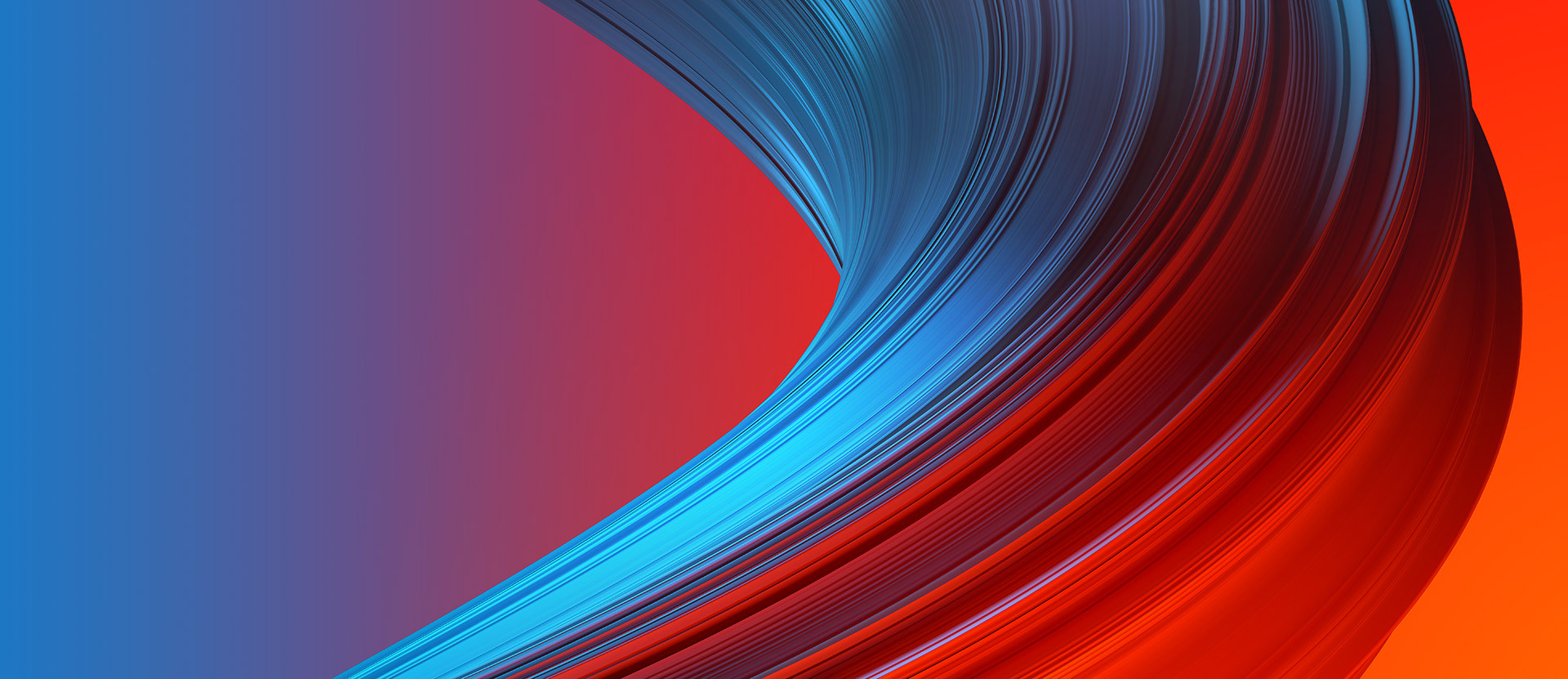
Final visual language
Concept explorations regarding visual components to create the colorful world the lens filters apply to the surroundings.
More color, more life was the payoff of the campaign and that should be visualized in an elegant way that references to the lenses without disrupting or overlapping the product too much. There was no way parts of the product should have been hid.
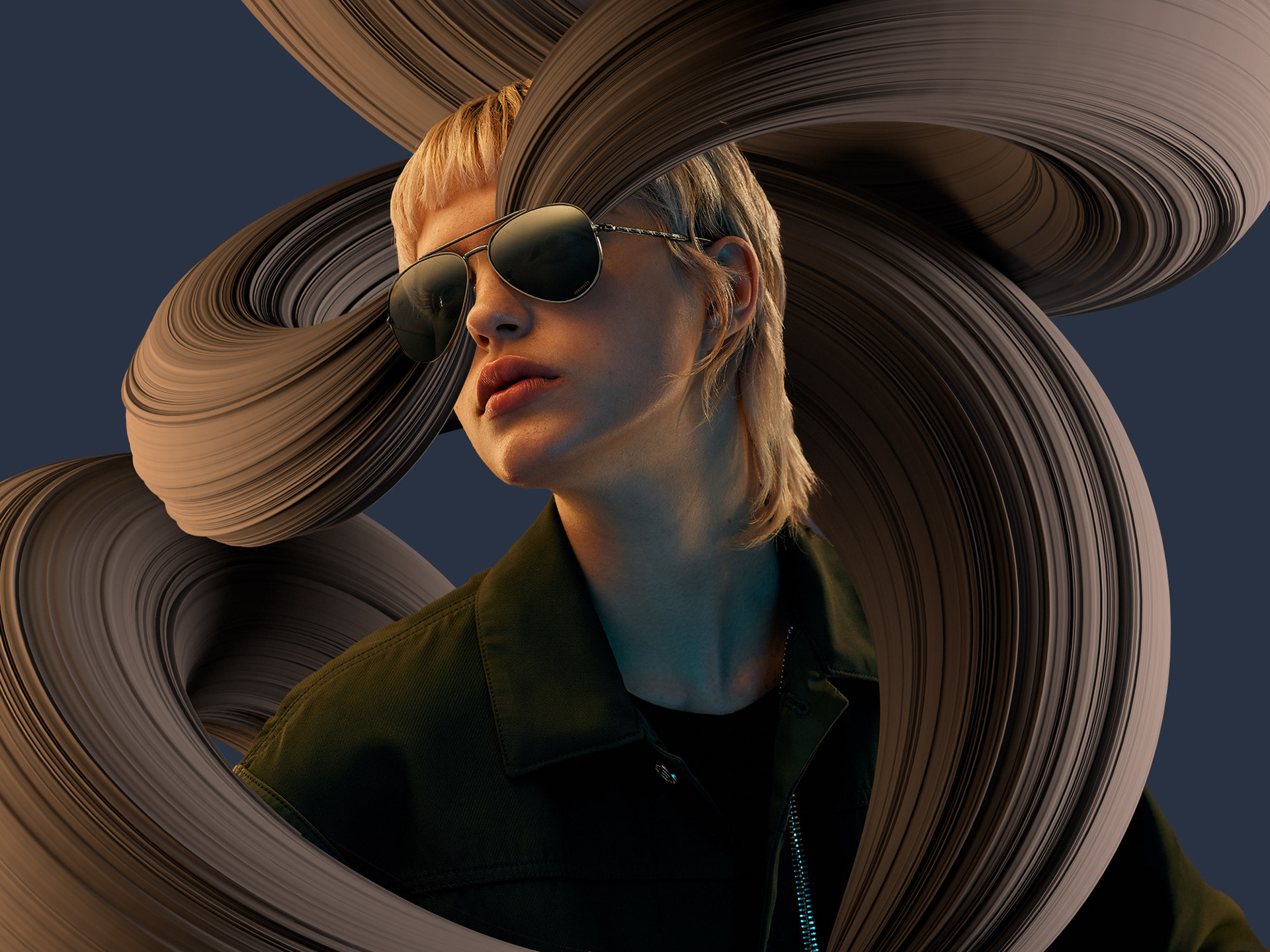
More color, more life was the payoff of the campaign and that should be visualized in an elegant way that references to the lenses without disrupting or overlapping the product too much. There was no way parts of the product should have been hid.