Z by HP
Rebranding
Rebranding
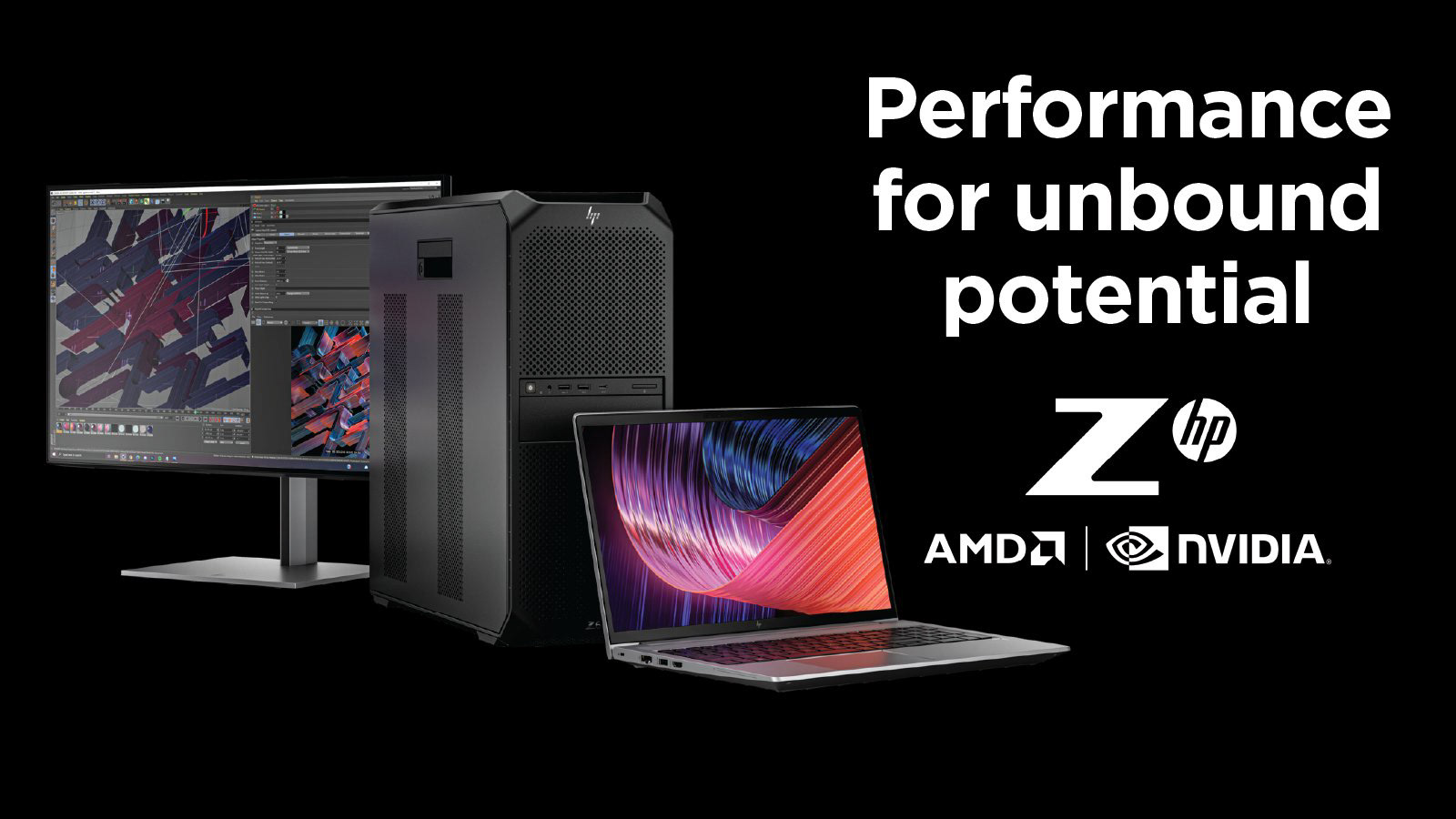
Developing branding assets for the rebranding of Z by HP has been a compelling journey. These assets find frequent application on social media platforms and serve as wallpapers on their cutting-edge machines, seamlessly integrating with the recently redesigned logo that introduces distinctive roundings.
The body of work undertaken aimed to resonate with the robust workstations Z by HP crafts for the dynamic creative industry. Guided by the principles of vibrancy, vividness, boldness, and elegance, the chosen typographic approach encapsulates the essence of these powerful computing solutions. Every element in the design contributes to creating a visual language that not only aligns with Z by HP's identity but also communicates the brand's commitment to excellence in the creative realm.

R&D phase
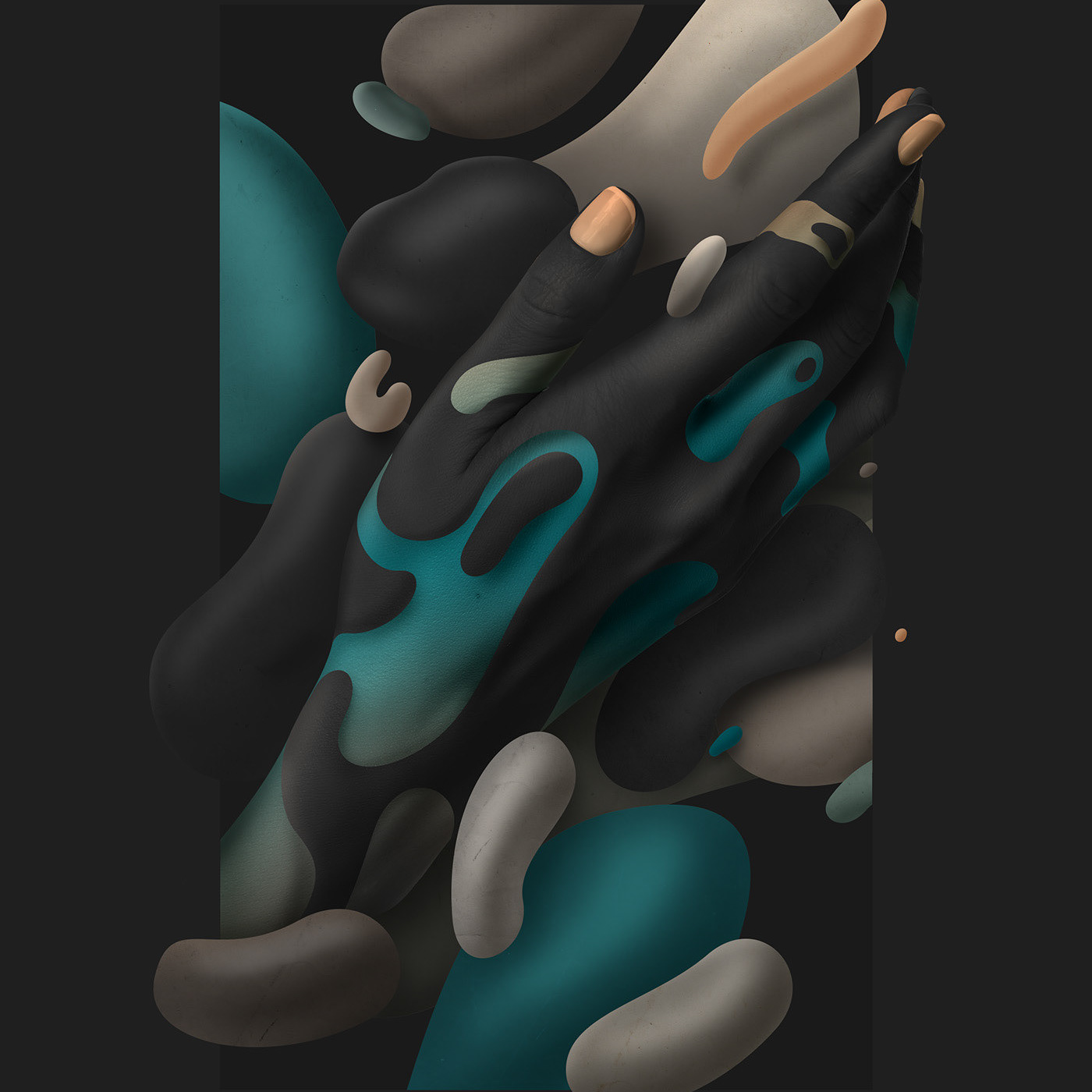
Abstract, Modern and yet a clear Z visable, in an Oostenbroek manner. These concepts are based off the top-tier product range and needed a 3D treatment, given its immense render power.
Abstract, Modern and yet a clear Z visable, in an Oostenbroek manner. These concepts are based off the top-tier product range and needed a 3D treatment, given its immense render power.


Final approach
An organic yet graphical treatment that leaves so many posibilities for the client to crop out interesting parts and serves many usecases.
An organic yet graphical treatment that leaves so many posibilities for the client to crop out interesting parts and serves many usecases.

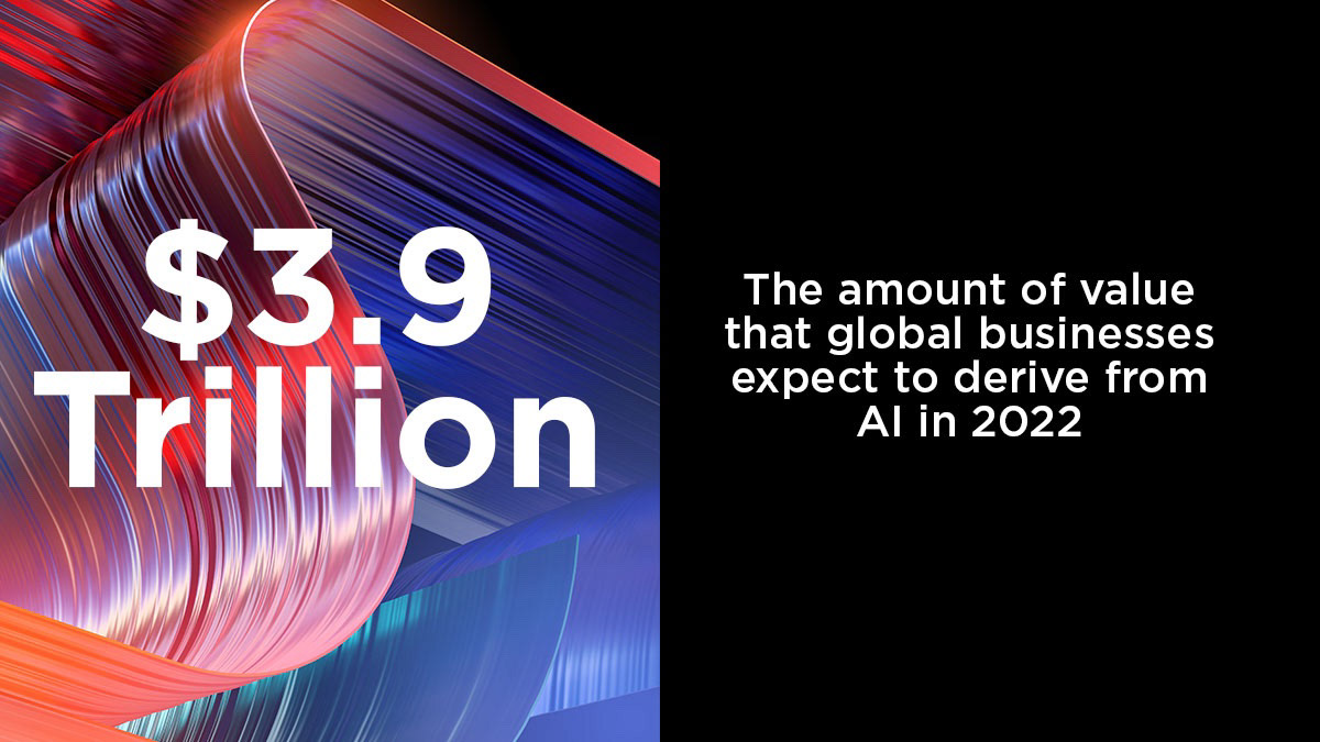
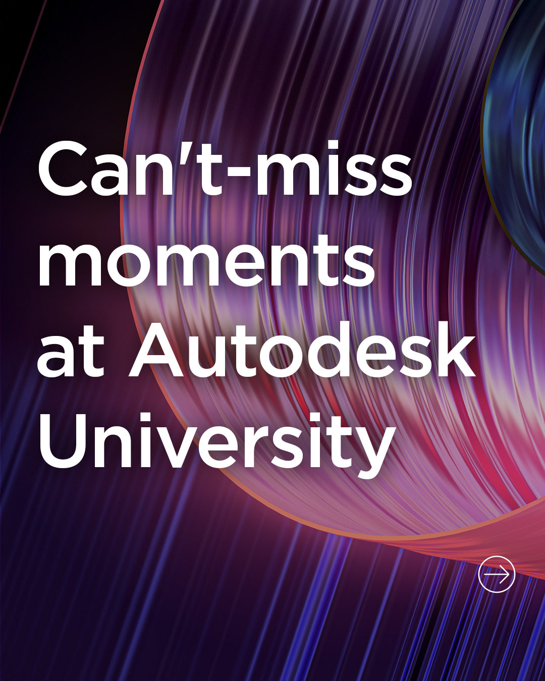
Crop/Camera angle examples.
Here you can see how a crazy hi-res 3D imagery is beneficial so the client can take multiple interesting angles from the same image, I also delivered a few extra camera angles so the variety was even bigger.
Here you can see how a crazy hi-res 3D imagery is beneficial so the client can take multiple interesting angles from the same image, I also delivered a few extra camera angles so the variety was even bigger.


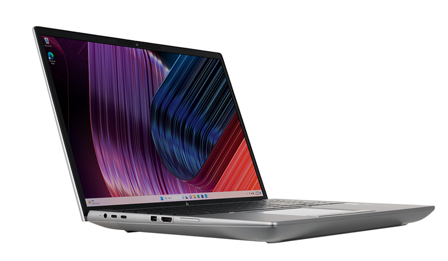
Usecases.